
高機能なグラフ描画用JavascriptライブラリHighchartsを使ってローレンツ曲線を描いてみました。
HichartsGPTが限界だった件
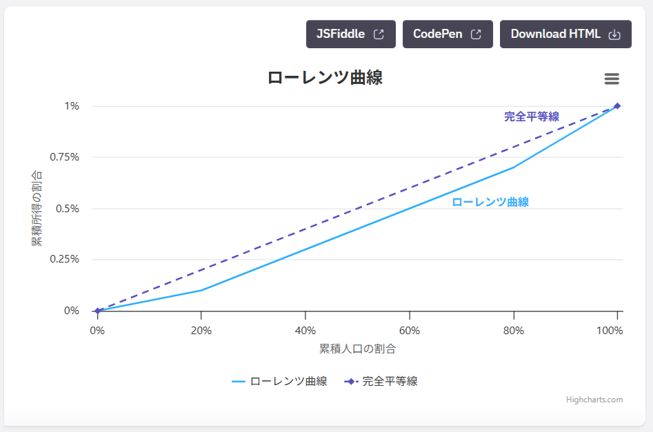
HichartsGPTにローレンツ曲線を描かせたら、さすがに基本的な描画はできました。

▼提示されたコード
Highcharts.chart('container', {
    chart: {
        type: 'line'
    },
    title: {
        text: 'ローレンツ曲線'
    },
    xAxis: {
        title: {
            text: '累積人口の割合'
        },
        labels: {
            format: '{value}%'
        }
    },
    yAxis: {
        title: {
            text: '累積所得の割合'
        },
        labels: {
            format: '{value}%'
        },
        max: 1
    },
    series: [{
        name: 'ローレンツ曲線',
        data: [
            [0, 0],
            [20, 0.1],
            [40, 0.3],
            [60, 0.5],
            [80, 0.7],
            [100, 1]
        ],
        marker: {
            enabled: false
        }
    }, {
        name: '完全平等線',
        data: [
            [0, 0],
            [100, 1]
        ],
        dashStyle: 'Dash'
    }]
});
▼実行結果
▼完全平等線とローレンツ曲線の間を塗りつぶしてね
⇒ ???それって単純な面グラフじゃね?
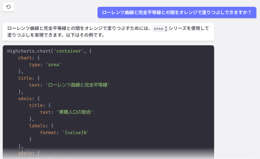
▼提示されたコード
Highcharts.chart('container', {
    chart: {
        type: 'area'
    },
    title: {
        text: 'ローレンツ曲線と完全平等線'
    },
    xAxis: {
        title: {
            text: '累積人口の割合'
        },
        labels: {
            format: '{value}%'
        }
    },
    yAxis: {
        title: {
            text: '累積所得の割合'
        },
        labels: {
            format: '{value}%'
        },
        max: 1
    },
    series: [{
        name: 'ローレンツ曲線',
        data: [
            [0, 0],
            [20, 0.1],
            [40, 0.3],
            [60, 0.5],
            [80, 0.7],
            [100, 1]
        ],
        marker: {
            enabled: false
        },
        fillColor: 'rgba(255, 165, 0, 0.5)' // オレンジ色で半透明
    }, {
        name: '完全平等線',
        data: [
            [0, 0],
            [100, 1]
        ],
        type: 'line',
        color: 'black',
        dashStyle: 'Dash'
    }]
});
▼実行結果
⇒ あ、やっぱり。。
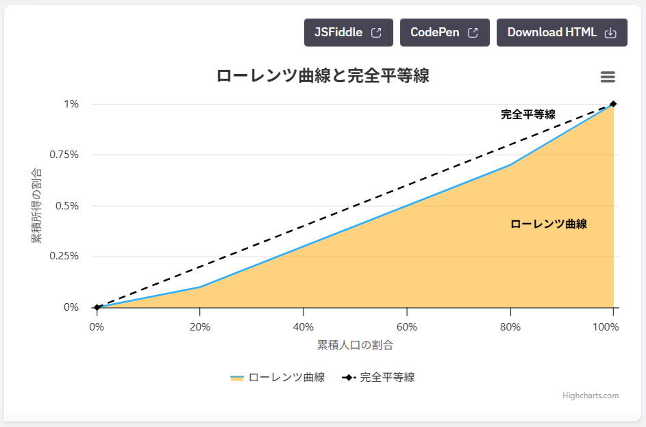
その後問答を繰り返すも改善されることはなく、まったく同じコードを返してくる。。
ChatGPTの方が優秀だったよ
HighchartsGPTが限界のようなので、ChatGPTに訊いてみたら一発で解決しました。
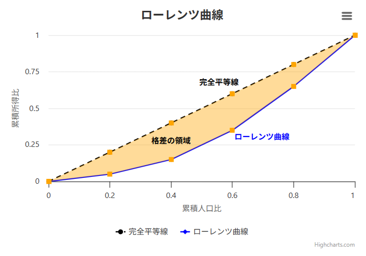
▼「JavascriptライブラリのHighchartsを使ってローレンツ曲線を描き、完全平等線とローレンツ曲線の間をオレンジ色で塗りつぶしてください。」
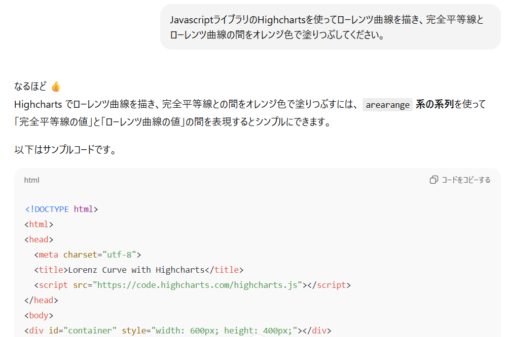
▼提示されたコード
⇒ なんか余計な事してる感じですが、結果をみてOKなら見逃すことにします。
<!DOCTYPE html>
<html>
<head>
  <meta charset="utf-8">
  <title>Lorenz Curve with Highcharts</title>
  <script src="https://code.highcharts.com/highcharts.js"></script>
</head>
<body>
<div id="container" style="width: 600px; height: 400px;"></div>

<script>
document.addEventListener('DOMContentLoaded', function () {
  // データ例(累積人口比, 累積所得比)
  const lorenzData = [
    [0, 0],
    [0.2, 0.05],
    [0.4, 0.15],
    [0.6, 0.35],
    [0.8, 0.65],
    [1, 1]
  ];

  // 完全平等線 y=x
  const equalityLine = lorenzData.map(([x, _]) => [x, x]);

  // arearange 用に [x, low, high] を生成(low = lorenz, high = equality)
  const areaData = lorenzData.map(([x, y], i) => [x, y, equalityLine[i][1]]);

  Highcharts.chart('container', {
    title: {
      text: 'ローレンツ曲線'
    },
    xAxis: {
      title: { text: '累積人口比' },
      min: 0,
      max: 1
    },
    yAxis: {
      title: { text: '累積所得比' },
      min: 0,
      max: 1
    },
    tooltip: {
      shared: true
    },
    series: [
      {
        type: 'line',
        name: '完全平等線',
        data: equalityLine,
        color: 'black',
        dashStyle: 'Dash'
      },
      {
        type: 'line',
        name: 'ローレンツ曲線',
        data: lorenzData,
        color: 'blue'
      },
      {
        type: 'arearange',
        name: '格差の領域',
        data: areaData,
        color: 'orange',
        fillOpacity: 0.4,
        lineWidth: 0,
        linkedTo: ':previous'
      }
    ]
  });
});
</script>
</body>
</html>
▼実行結果@JSFiddle
⇒ まあ、なんか余計な事してますが、さすがです!(オレンジマーカー要らない)
▼「ジニ係数もよろ」
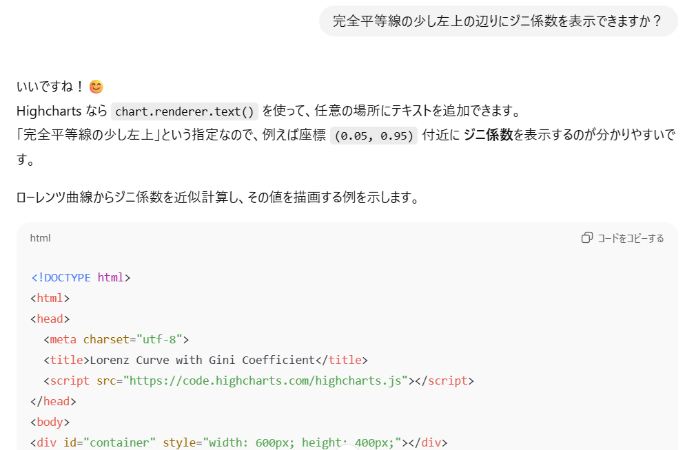
▼提示されたコード
<!DOCTYPE html>
<html>
<head>
<meta charset="utf-8">
<title>Lorenz Curve with Gini Coefficient</title>
<script src="https://code.highcharts.com/highcharts.js"></script>
</head>
<body>
<div id="container" style="width: 600px; height: 400px;"></div>
<script>
document.addEventListener('DOMContentLoaded', function () {
// データ例(累積人口比, 累積所得比)
const lorenzData = [
[0, 0],
[0.2, 0.05],
[0.4, 0.15],
[0.6, 0.35],
[0.8, 0.65],
[1, 1]
];
// 完全平等線 y=x
const equalityLine = lorenzData.map(([x, _]) => [x, x]);
// arearange 用に [x, low, high]
const areaData = lorenzData.map(([x, y], i) => [x, y, equalityLine[i][1]]);
// --- ジニ係数の計算 ---
// 台形公式でLorenz曲線下の面積を近似し、Gini = 1 - 2 * 面積
let area = 0;
for (let i = 1; i < lorenzData.length; i++) {
const [x1, y1] = lorenzData[i - 1];
const [x2, y2] = lorenzData[i];
area += (x2 - x1) * (y1 + y2) / 2;
}
const gini = 1 - 2 * area;
const chart = Highcharts.chart('container', {
title: {
text: 'ローレンツ曲線'
},
xAxis: {
title: { text: '累積人口比' },
min: 0,
max: 1
},
yAxis: {
title: { text: '累積所得比' },
min: 0,
max: 1
},
tooltip: {
shared: true
},
series: [
{
type: 'line',
name: '完全平等線',
data: equalityLine,
color: 'black',
dashStyle: 'Dash'
},
{
type: 'line',
name: 'ローレンツ曲線',
data: lorenzData,
color: 'blue'
},
{
type: 'arearange',
name: '格差の領域',
data: areaData,
color: 'orange',
fillOpacity: 0.4,
lineWidth: 0,
linkedTo: ':previous'
}
]
});
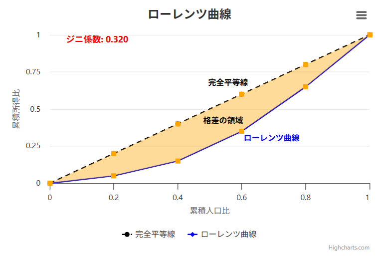
// --- ジニ係数を表示 ---
chart.renderer.text(
'ジニ係数: ' + gini.toFixed(3),
chart.xAxis[0].toPixels(0.05), // x=0.05付近
chart.yAxis[0].toPixels(0.95) // y=0.95付近
)
.css({
color: 'red',
fontSize: '14px',
fontWeight: 'bold'
})
.add();
});
</script>
</body>
</html>▼実行結果@JSFiddle
⇒ さすがです!
自分用に整形してみる
ChatGPTのアニキ、素晴らしい仕事してくれたけど、
- オレンジのマーカーは要らないよね ⇒ marker: { enabled: false }
- ジニ係数は少数2桁でイイよね ⇒ gini.toFixed(2)
- 線の説明は要らないよね ⇒ name: ”
- 凡例も要らないよね ⇒ legend: { enabled: false }
- データエクスポートのハンバーガーメニューも要らないよね ⇒ exporting {enabled: false }
- Highchartsのクレジットは消したいよね ⇒ credits: { enabled: false }
▼というわけで、これらを反映したもの
document.addEventListener('DOMContentLoaded', function () {
  // データ例(累積人口比, 累積所得比)
  const lorenzData = [
    [0, 0],
    [0.2, 0.05],
    [0.4, 0.15],
    [0.6, 0.35],
    [0.8, 0.65],
    [1, 1]
  ];

  // 完全平等線 y=x
  const equalityLine = lorenzData.map(([x, _]) => [x, x]);

  // arearange 用に [x, low, high]
  const areaData = lorenzData.map(([x, y], i) => [x, y, equalityLine[i][1]]);

  // --- ジニ係数の計算 ---
  // 台形公式でLorenz曲線下の面積を近似し、Gini = 1 - 2 * 面積
  let area = 0;
  for (let i = 1; i < lorenzData.length; i++) {
    const [x1, y1] = lorenzData[i - 1];
    const [x2, y2] = lorenzData[i];
    area += (x2 - x1) * (y1 + y2) / 2;
  }
  const gini = 1 - 2 * area;

  const chart = Highcharts.chart('container', {
    title: {
      text: 'ローレンツ曲線'
    },
    credits: { enabled: false },
    exporting: {enabled: false },
    legend: { enabled: false },
    xAxis: {
      title: { text: '累積人口比' },
      min: 0,
      max: 1
    },
    yAxis: {
      title: { text: '累積所得比' },
      min: 0,
      max: 1
    },
    tooltip: {
      shared: true
    },
    series: [
      {
        type: 'line',
        name: '',   // 完全平等線
        data: equalityLine,
        color: 'black',
        dashStyle: 'Dash',
        marker: { enabled: false }
      },
      {
        type: 'line',
        name: '',   // ローレンツ曲線
        data: lorenzData,
        color: 'blue',
        marker: { enabled: false }
      },
      {
        type: 'arearange',
        name: '',   // 格差の領域
        data: areaData,
        color: 'orange',
        fillOpacity: 0.4,
        lineWidth: 0,
        linkedTo: ':previous',
        marker: { enabled: false }
   }
    ]
  });

  // --- ジニ係数を表示 ---
  chart.renderer.text(
    'ジニ係数: ' + gini.toFixed(2),
    chart.xAxis[0].toPixels(0.05), // x=0.05付近
    chart.yAxis[0].toPixels(0.95)  // y=0.95付近
  )
  .css({
    color: 'blue',
    fontSize: '14px',
    fontWeight: 'bold'
  })
  .add();
});
▼実行結果@JSFiddle
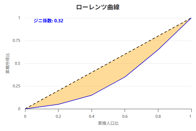
こんな感じでシンプルになりました。
- 0
- 0
- 0
- 0


コメント